
About Bootstrap
Bootstrap is a popular open-source CSS framework that allows developers to build fast and responsive websites. Responsive attributes take care of the layout for different screen sizes such as mobile, tablet, and desktop.

Simple Integration
Bootstrap works well with other frameworks and platforms, including Angular and React. It allows developers to create websites or add elements to existing websites and CSS files.

Great Grid System
The grid system is probably the most powerful tool a developer will use in Bootstrap because everything works inside the grid. Behind the scenes, Bootstrap grid uses the flexbox function to position elements and to ensure everything is where it should be.
Good Documentation
Bootstrap provides comprehensive documentation that includes examples and demos to make it easier for everyone, especially beginners. It also provides a great search engine with suggestions that make it easy to look for components.
Components
Bootstrap offers components that are practical, straightforward, and efficient.
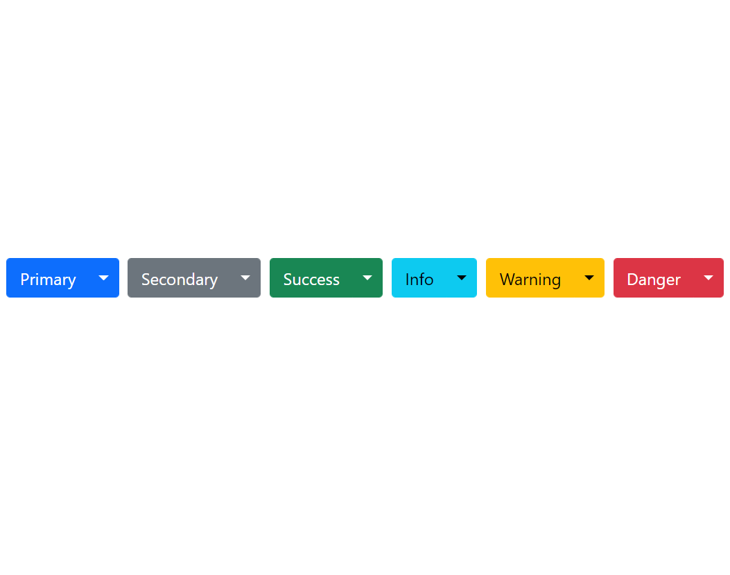
Dropdowns
Bootstrap's dropdown menu is a predefined menu that allows the user to select their desired value from the list. Bootstrap's dropdown menu offers different directional menus, including Dropup, Dropright, and Dropleft.
Developers can turn any button or link into a dropdown menu by adding <div class="dropdown"> with a few changes to a button's or link's definitions. You are also able to use different colours and sizes for your dropdown menu.
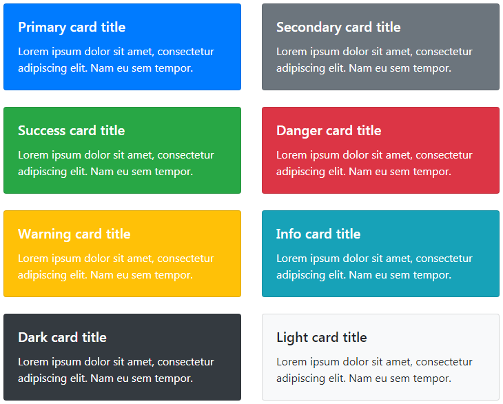
Cards
Bootstrap's card is an excellent way to create flexible and extensible content containers. Bootstrap's card framework offers many useful and powerful features, including headers, footers, content, and background colours.
In order to use cards, a developer will need to add <div class="card"> to their content. The content could be a mixture of any card class, for example, image, body, text, link, etc. The default value of cards' width is 100%; however, they may be changed based on the needs and requirements of the developer.
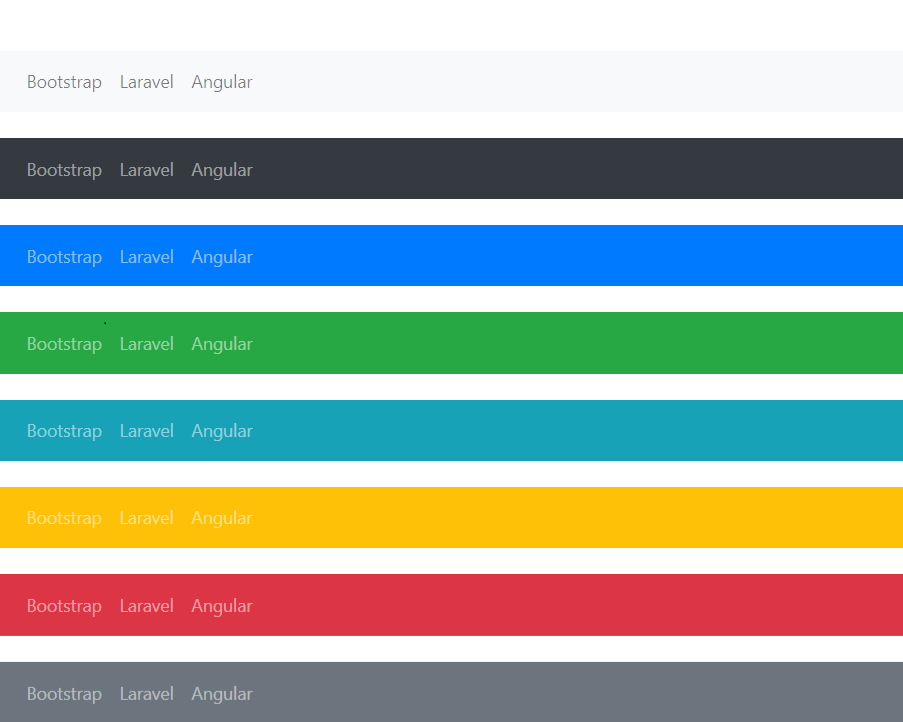
Navbar
Bootstrap's navbar is a responsive navigation header that can extend or collapses depending on the screen size. Bootstrap navbar offers many useful and powerful features, including branding, navigation, forms, colour schemes, and more.
In order to use navbar, <nav class="navbar navbar-expand{-sm|-md|-lg|-xl|-xxl"}> is required and it is based on preference of collapsing navigation header on different screen size.